
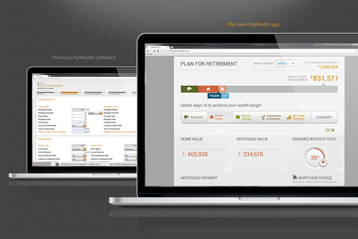
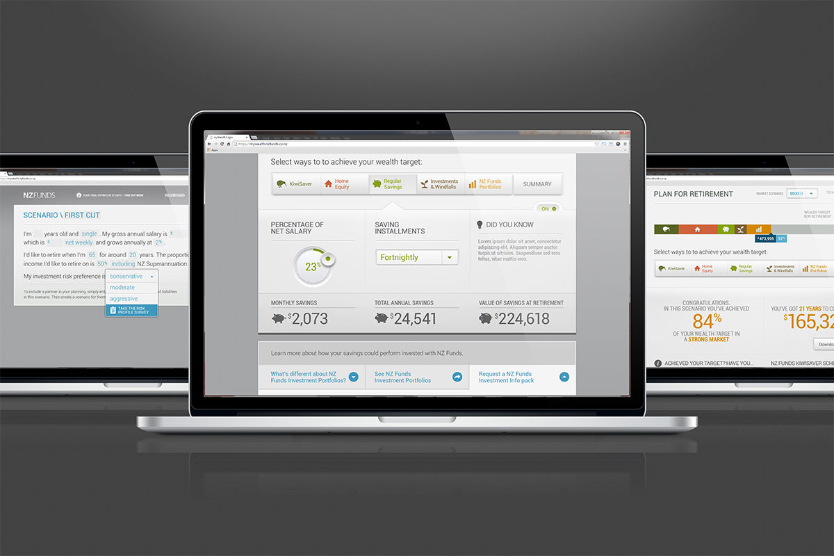
nz funds mywealth app
Manage your financial goals with NZ Funds myWealth, a touch-friendly and intuitive web app. Building your wealth scenario is as easy as completing your financial 'story', then populating relevant savings such as KiwiSaver, home equity, regular savings and others by dragging sliders, dials, toggles, etc. Your results are presented in real time. Managing your future savings can now be fun with NZ Funds myWealth app.
Client: NZ Funds
Award: Best Effect Award 2013, Silver
Roles: art direction / UI design / interaction design / client presentation
the challenge
How do you take out the dreary aspect of managing and planning your future savings from mundane tasks, such as filling online accounting forms or using calculators, into an activity that is fun and engaging? This was the main creative challenge that NZ Funds brought to the table when they approached TBWA\Tequila.
the SOLUTION
With a core team of five: a CD, two senior designers, a PM and a developer, we formulated the concept of a web-based app that was accessible by customers using different browsers. This app should work like an interactive dashboard that was easy to use, as if one were adjusting a digital radio or boombox. First, I researched UI patterns that would fit the boombox paradigm such as slider bars and dials; basically I was looking for input mechanism that had tactility to them. The buttons were then crafted so it was easy to interact with whether you were accessing the app through your desktop browser or your tablet device. As you manipulate these interfaces, you could immediately see the amount of time, money or investment changing right there and then without submitting any form.
From the get-go we, as a team, designed the optimum experience for the latest browsers, which would then degrade into a pure functional dashboard for those accessing the app using older browsers.
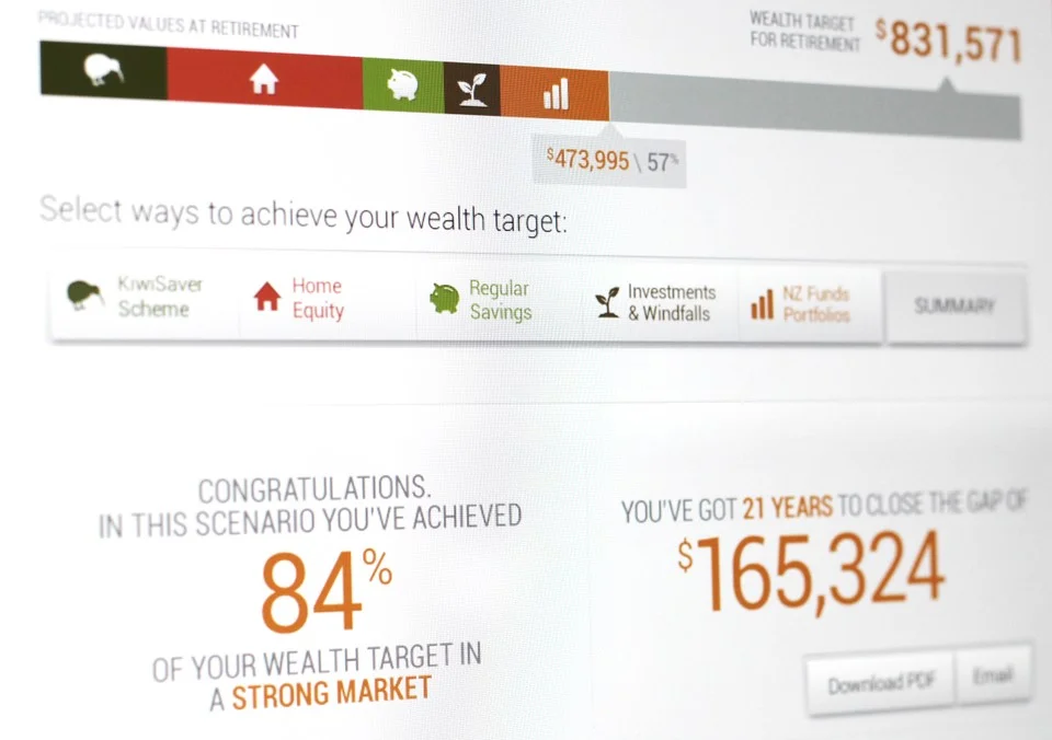
An important aspect of the project was the need to revise the Information Architecture so we could untangle the complexity of how to manage your wealth. We did this by re-arranging the order of your savings/investments as follow: KiwiSaver, home equity, regular savings, investments & windfalls, and NZ Funds portfolios.
They are laid out as a simple sequence of large buttons across the dashboard. Clicking on a button would prompt you different types of investment panel with its own set of user interfaces.
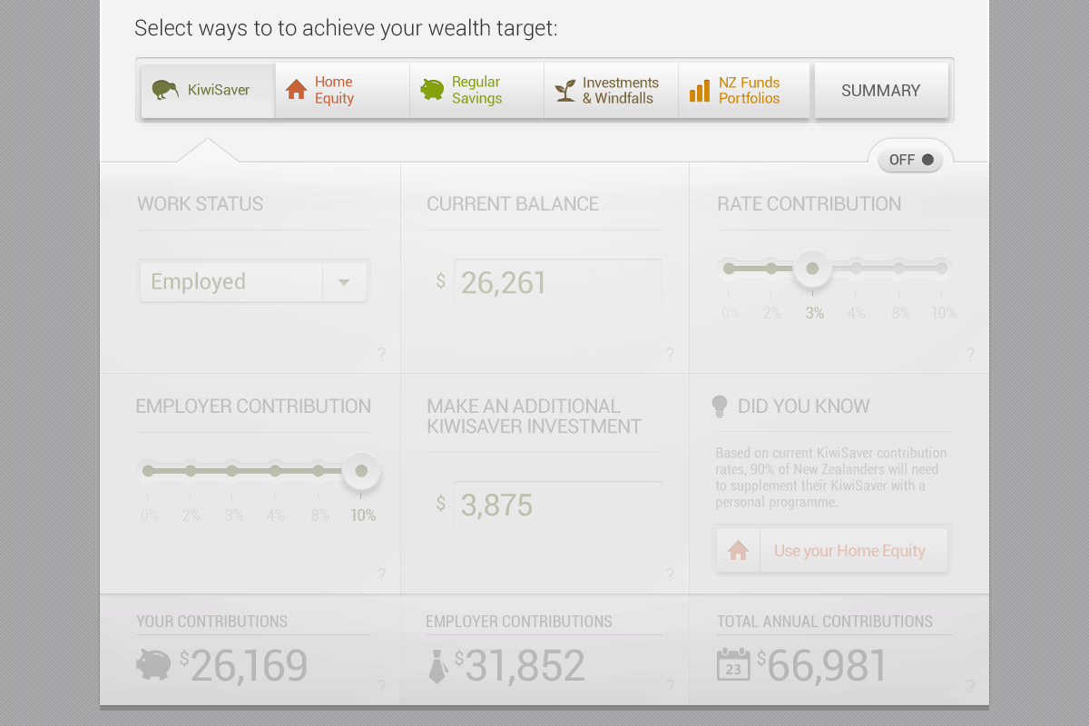

Furthermore, adding a type of investment is as easy as turning that page 'on' or 'off' (left image). And every investment you've entered will immediately affect the corresponding result fields, as well as adding a colored bar that builds towards your wealth goal. We've also added Tool Tip for some input area based on users pain points (right image).
Each panel has a consistent look & feel, but slightly different user interfaces as the content dictates. Every little design detail adds up to a user experience that is at once seamless, but also easy to digest. For example, a customer can choose the right KiwiSaver contribution rates through a slider button. Exposing the rates rather than 'hiding' them inside a drop down menu gives instant clarity. This helps the customer make a quick decision by looking at the immediate results. Tool tips are provided at certain input area where we had the most pain points based on existing user analysis.
GAMIFIcation
Building on the success of Sovereign Choose Your Life insurance game we opted for the gamified approach with myWealth, where a customer interact with the app in a manner akin to playing with a digital boombox (ie. sliding rates bars, dialing up/down contribution percentage or tapping large buttons). The app encourages you to keep building towards your financial goals with a sense of immediacy by rewarding every interaction with instant graphical results (the core characteristic of a video game).
The app is touch-friendly and built entirely on HTML/CSS/JS. In terms of collaboration, we involved the NZ Funds product owner and stakeholders at every milestone to make sure our solution was aligned with their vision and business goals.

The ability of the app to turn an otherwise mundane and complex wealth management system into a fun, educative and intuitive experience was recognised by Best Design Awards 2013, where it won silver in the Best Effect category.